SUSAN DESIGNS
Back to projects
Pan African Website Revamp
Project Overview
Pan African Towers is a leading telecommunications infrastructure provider in Nigeria. I was brought on board to lead the complete revamp of their corporate website, with the goal of transforming it into a more modern, intuitive, and professional digital experience. The previous site lacked structure, clarity, and responsiveness — making it difficult for stakeholders, partners, and potential clients to understand the company’s offerings.
This redesign focused on improving the user journey, showcasing key services, and communicating the brand’s leadership in the telecom space. My role spanned research, wireframing, high-fidelity UI design, and collaboration with developers to bring the vision to life.
Project type
Landing Page
Timeline
1 week
Tools used
Figma
Project status
Live
Pan African Towers
Problem
Pan African Towers’ original website did not reflect the company’s growth, professionalism, or leadership in the telecommunications industry. The interface was outdated, lacked clear navigation, and failed to communicate the full scope of services offered. Users found it difficult to understand what the company did, how to engage with them, or access relevant information quickly.
Additionally, the site was not mobile-responsive, leading to a frustrating experience for users accessing it on smartphones or tablets — a major issue in Nigeria’s mobile-first market. The visual design lacked consistency and did not align with the company’s brand identity, making the overall experience feel unpolished and unreliable to potential clients and partners.
These issues collectively hindered trust, reduced engagement, and limited the company’s ability to attract and convert business opportunities through its digital presence.
Solution
To address these challenges, I led a full-scale website redesign that focused on clarity, responsiveness, and brand alignment. I began by conducting a comprehensive UX audit and competitor analysis to understand user pain points and benchmark best practices within the telecommunications industry.
I restructured the information architecture to ensure content was intuitive, easy to navigate, and prioritized based on user needs. I also created detailed wireframes and prototypes to validate flow and hierarchy before moving into high-fidelity design.
The new interface featured:
A modern, responsive design that worked seamlessly across devices.
A clearer layout and navigation system to guide users to services, insights, and contact points more efficiently.
Stronger visual branding, with updated typography, consistent iconography, and color schemes that aligned with Pan African Towers’ identity.
Interactive elements like animations, hover states, and call-to-action buttons that improved user engagement.
Results & Outcomes
Results & Outcomes
60% improvement in site navigation clarity based on internal stakeholder feedback and user testing.
Increased engagement through clearer content hierarchy and accessible CTAs — users now spent more time exploring key service areas.
Enhanced mobile experience, with a fully responsive design that improved usability across smartphones and tablets.
Boost in brand perception, with the client reporting stronger credibility and trust from partners after the relaunch.
Faster page load times and optimized structure contributed to smoother performance and reduced bounce rates.
Positioned Pan African Towers as a modern, reliable telecom brand, better aligned with its industry leadership and growth goals.
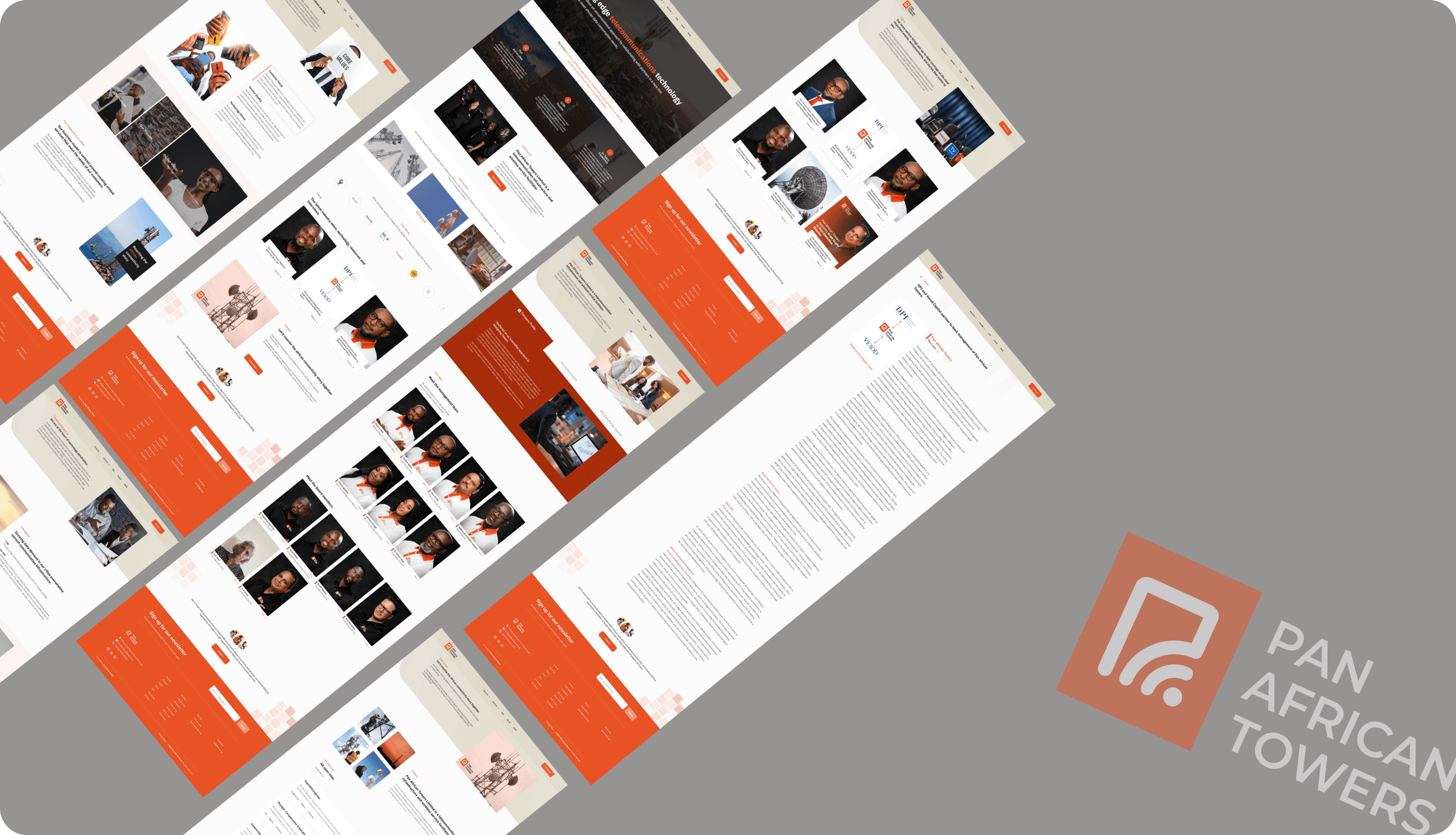
Website screenshots
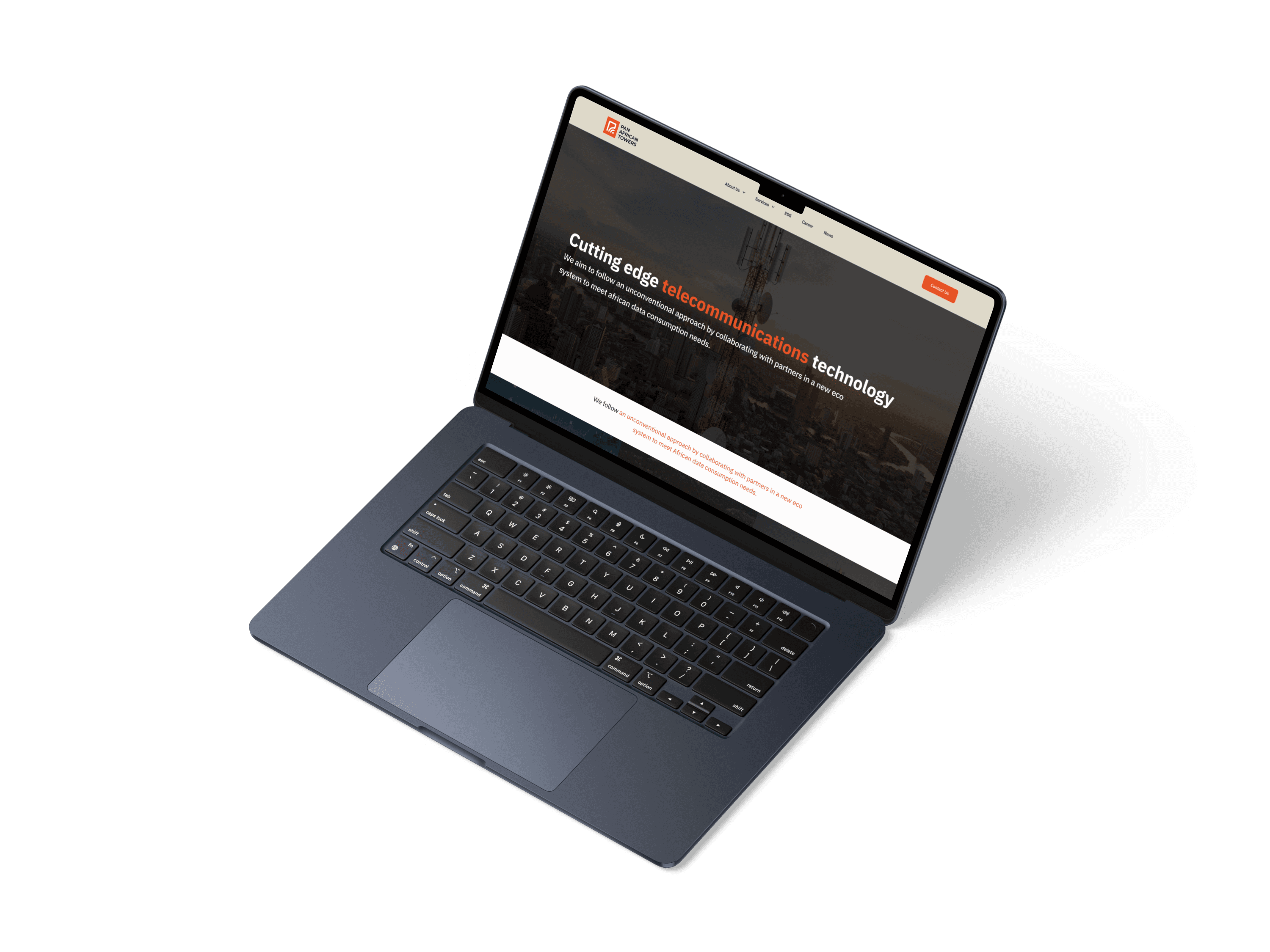
🔧 Homepage — Before & After
The old homepage was cluttered, lacked hierarchy, and made it difficult for users to understand what Pan African Towers offered. Key actions like “Contact Us” or “Explore Services” were buried in text or hard to locate.
The redesigned homepage features a clean, modern layout with clear call-to-actions, streamlined content, and visual hierarchy that guides users intuitively. Important services are now easily accessible, while the interface better communicates the brand’s professionalism and scale.
🏢 About Us Page — Before & After
The previous About Us page was text-heavy, uninspiring, and failed to communicate the brand’s values or industry relevance. It lacked visuals, structure, and a sense of identity.
In the new version, the story of Pan African Towers is presented through well-structured content, visual storytelling, and team highlights. The page now clearly showcases the company’s mission, telecom expertise, and leadership, helping build trust with stakeholders and potential partners.
See live website
sheidususan Design Portfolio @2025
SUSAN DESIGNS
Want to start a project?
Let's collaborate to transform your ideas into impactful designs that drive success. Reach out today, and together, we'll bring your vision to life
Let’s talk